The ecommerce industry is a fiercely competitive one, with new online stores popping up every day. Thus, to remain competitive and attract new users as well as retain current shoppers, the minimal requirement for any ecommerce store is to be as user-centric as possible. Great user experience equals high conversion rates, so it’s essential to watch out for the UX inconsistencies that can make even the most loyal customers turn to the competition. Below, we list the biggest UX mistakes in ecommerce that impact your sales and provide actionable recommendations on remediating them.

What are UX design mistakes in ecommerce?
UX design mistakes in ecommerce are the ones that:
- Introduce barriers to a natural progression of user journey
- Fail to address usability issues and compromise user experience
- Discourage users from taking a certain action
- Cost businesses lost conversions and low user engagement
Sometimes, you may not even be aware of these issues, as most of them are not really obvious. Together with SoftTeco’s UX/UI Designer Anna Puzynovich, we discuss the top UX issues that most ecommerce stores encounter.
1. Login issues
Registration and login are among the first things that shoppers do when visiting an online store. Hence, if there are any issues with these actions, user experience will be negatively affected right from the start, and we don’t want that. So, what are the most common mistakes that are related to login and registration?
Credentials of returning users are not remembered
Once shoppers overcome the not-so-liked hassle of creating a new account and logging in, they most likely expect the platform to remember their login credentials for the future. Most ecommerce stores usually ask whether a user wishes to save their login data, but some stores overlook this seemingly minor detail. As a result, users have to enter the credentials manually upon every store visit, which can lead to them getting annoyed and discouraged from further store navigation.
No express login flow provided
Express login is among those things that make the whole process easier for those users who have forgotten their credentials and need quick access. An example would be a one-time link sent to an email, an SMS code or push notification via OTP/2FA. However, a lot of ecommerce stores lack this feature, forcing users to create a whole new password each time they can’t remember a current one, reinforcing the association of login with inconvenience.

No social media login
Integrating social media logins greatly reduces the risk of failed login attempts and shoppers dropping off. So if your store doesn’t offer this option, it could be one of the reasons why you don’t have as many users as you’d like. Surely, the decision to offer social login options isn’t always an easy one for ecommerce businesses, which have to weigh convenience against security and privacy concerns. Despite these challenges, using reputable authentication providers, adopting robust security protocols and maintaining transparency can help ecommerce sites deliver a smooth social login experience to a wider audience.
2. No guest checkout
The checkout process is a crucial stage where shoppers tend to abandon their carts, so it has to be highly convenient and prevent any challenges for the user, for example the absence of a guest checkout option.
When completing the conversion process, a user is usually requested to log into the system or create an account up front. The reason behind this is user data is pivotal for businesses in customizing marketing campaigns, learning more about their audience, and building loyalty with returning customers. However, the guest checkout creates favorable conditions for impulse and one-time purchases, because a user doesn’t get distracted from actual shopping. Thus, weigh the priorities before you decide against implementing a guest checkout.
3. Complex navigation
While some users already know what they want to buy when landing on an ecommerce site, many of them are also just curious and want to see what the store offers. So if you have lots of content and pages, and they are not organized properly, you might be in trouble. Confusing and complex navigation is a big UX problem in ecommerce and is one of the top reasons for a high bounce rate and can heavily discourage users from completing their purchase. The most common issues related to store navigation are:
- Overload of product categories: there are just too many categories, though most of them can be merged into one.
- Overload of dropdowns: an excessive number of dropdown menus, especially when combined with an already content-heavy interface, can lead to confusion and cognitive overload.
- Buttons like “Home” or “Back” are not visible: when a user is lost or confused, they most likely would prefer to go to the main page or to the one they visited before. If such buttons are not visible, users will most probably leave the site.
- Breadcrumbs are not visible or clear: breadcrumbs help users instantly understand where exactly on the website they are. Unclear or poorly visible breadcrumbs will simply add to the confusion.
Google’s UX Playbook for Retail offers several valid tips on improving the navigation of your store. They include the use of a consolidated menu, organization of subcategories in alphabetical order, and order of main menu categories by traffic volume. Also, make sure that a user always knows where they are and that there are supportive elements on every page.
4. Poor or broken search
The search option is a must for an ecommerce store or any website, to be honest, since it a) directly leads users to the desired product and b) offers cross-selling and upselling opportunities. Unfortunately, many ecommerce stores have non-optimized or broken search, which later results in a drop in conversions and reduced user engagement. Let’s look into the most common issues with search.
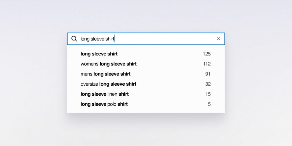
No feature (thematic) search
The most common type of search is when a user searches for a specific item: say, a blouse. But what if a user also wants to search for an item with particular features, like a striped blouse? In case your search is not optimized for an “item + its characteristics” combo, the user may encounter an error message and will not get desired results. Hence, it’s best to include an option of searching both items and their features instead for user convenience.
Search results not returned
If a user searches for a product and the site says “Sorry, no product found”, this leaves the user dissatisfied and will most likely result in shoppers leaving the site for alternatives. Hence, it is imperative to always return search results or, if the item does not exist on the site or in the inventory, to suggest other options that might interest the user. Here, it is a good idea to implement an ML-based personalization algorithm to enhance user experience and make sure that the user is always offered something relevant.
Poor autocomplete suggestions
Autocomplete suggestions are an important search feature, as they help users find the needed item much faster and promote further website browsing. However, if you don’t have an autocomplete feature on your site, those users who are hesitant or not sure about the product will most probably abandon the store if there is no extra assistance from your side.
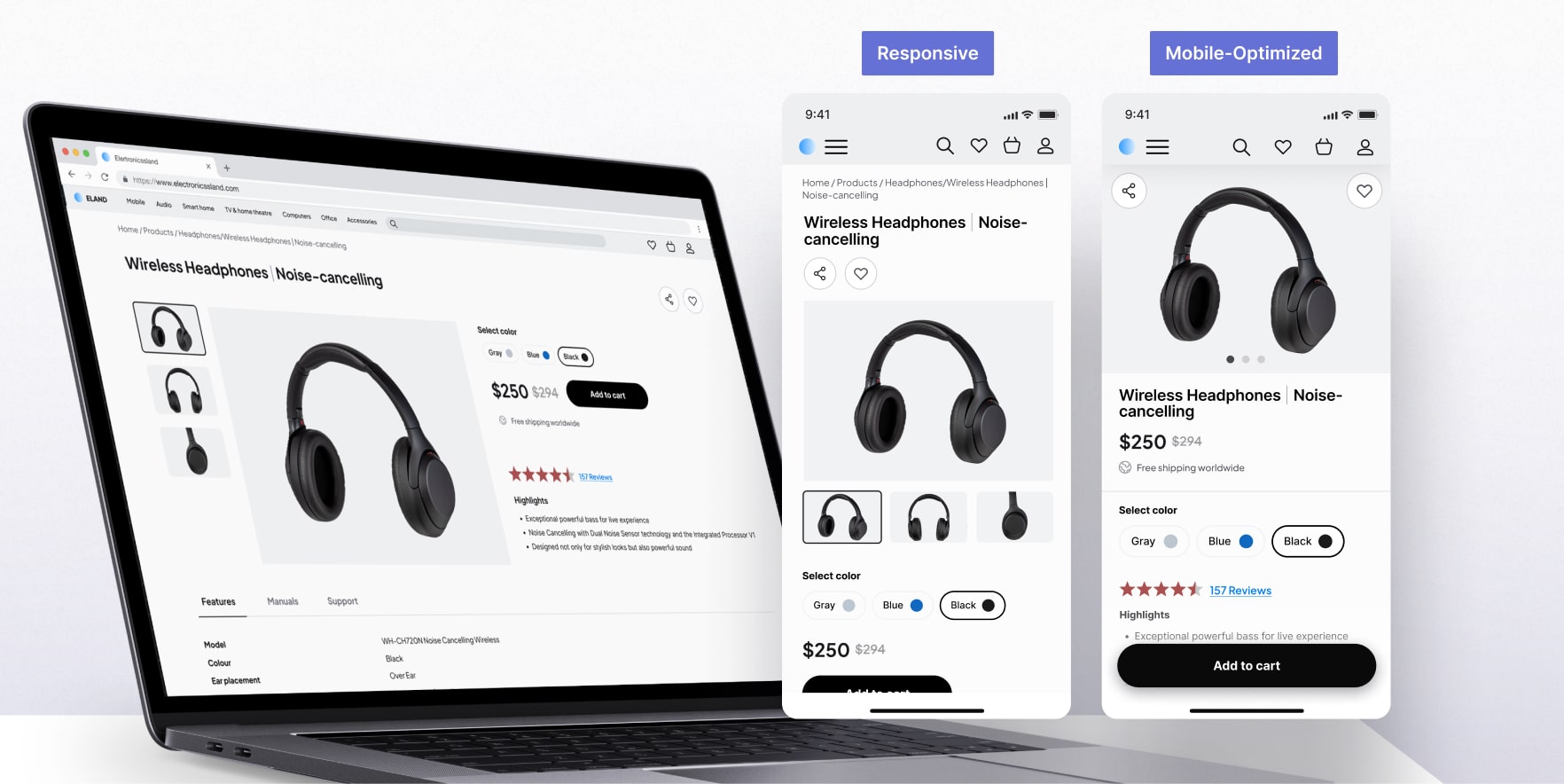
5. Non-responsive and non-adaptive design
Responsiveness of your store is another critical factor that impacts conversions and forms either a positive or negative user experience. By responsiveness, we mean the ability of a site to resize and rearrange itself in correspondence with the screen size and the device in use.
From a mobile usability perspective, even with flexible grids and fluid media, responsive layouts can become cramped and difficult to navigate on smaller screens. A dedicated mobile-optimized (adaptive) design is often a more effective solution. Unlike responsive design that adjusts to various screen sizes dynamically, adaptive design creates distinct layouts for specific breakpoints.
Expert Opinion
There’s a 75% chance that your primary website audience is using a mobile phone. If you’ve done your research and found this to be true for your business, I’d recommend designing with a mobile-first approach and then scaling up to a desktop. This approach lets you prioritize elements and streamline the user journey for mobile-specific tasks such as product browsing.
The reason it’s not the best practice to channel desktop-based design decisions into mobile interfaces is because mobile users have unique habits, interaction patterns, and shorter attention spans due to limited content view size.
Clear content hierarchy is what I’d start from. Focus on the most important info and primary actions. Breaking down complex desktop pages like product customization or checkout details into multiple, streamlined screens will also increase action success rates and overall usability. Be sure to integrate navigation patterns that are native to mobile, such as tab bars.
Remember that mobile interactions are primarily touch-driven. Responsive designs will likely not account for larger tap targets and sufficient spacing between interactive elements. Save your users the effort by ensuring that buttons, links, and form fields are large enough to be easily tapped.
Another tip is to take advantage of mobile-specific features like camera access for quick uploads or push notifications for timely updates. These will provide context-relevant functionality that keeps users engaged.
6. Overuse of popups
If you ever shopped online, you must be familiar with pop-ups. These small windows appear on the screen during your session and propose a unique and, most often, a one-time offer. The main goal of pop-ups is to encourage users to complete a certain action: sign up for a newsletter, make a purchase for a certain amount of money, or become a member of a community. In return, pop-ups always offer certain value: a discount, unique offers, etc. So, what can possibly go wrong here?
The thing is, if you overdo your pop-ups and use too many of them, users will get annoyed due to constant distraction from shopping. Thus, the best pop-up practices are:
- Timely use: if you want to offer a discount to new users, you can use a pop-up shortly after a new user lands on the main page.
- Do not make pop-ups reappear: if a user closed it once, do not show the same message again.
- Ensure a popup is easy to close: even if the “cross” button for closing is not visible, a user should be able to close the popup by clicking on the outside area (anywhere on the page).
7. Hidden fees and lack of transparency
Hidden fees are probably the main reason why shoppers abandon their carts and overall decide to leave the website, so it’s important to understand what exactly it means.
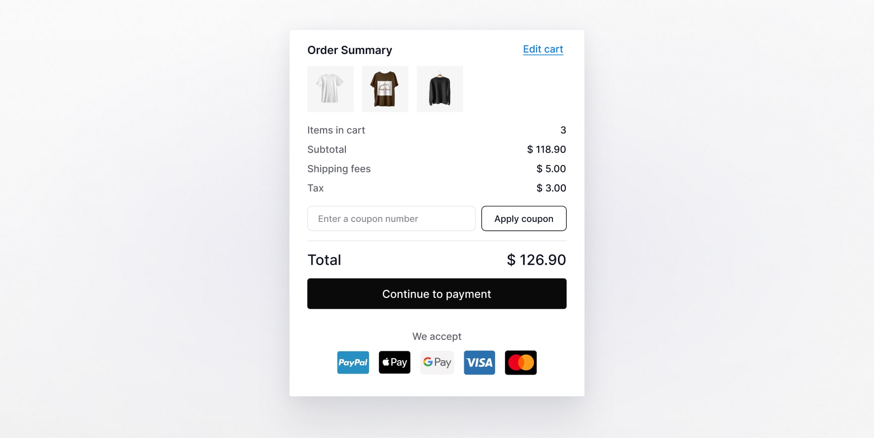
Hidden fees imply the ones that are not obvious or visible from the start, like shipping fee or taxes. Some ecommerce stores display these fees only at the last step of the checkout and obviously, most shoppers get discouraged since they were initially hoping to pay a different price.
That being said, make sure that:
- Your return policy is visible and clear
- Shipping can be calculated before a user proceeds to checkout
- The information on additional charges is visible and is presented to users on early stages of checkout.
One more thing to remember is that if a store is international, sometimes it’s not clear in what currency the user will be charged. All information related to product pricing should be instantly accessible and visible, and the user should not have to search the whole website for it.
8. Poor sharing options
Sharing a purchase or a product of interest with friends is an important part of a shopping experience for many people. Also, many ecommerce stores encourage users to invite friends to the platform in exchange for some incentives (discounts, coupons, etc.). However, if the sharing process is inconvenient and non-optimized, it might negatively impact the user experience. Below are the two biggest sharing issues:
No social media integrations
We expect to see social media icons on almost every site we use, and ecommerce is no exception. It is recommended to enable social media sharing on product pages so users can post their purchases to their profiles, add items to a wishlist, or easily share the desired items with friends.
Broken link copying
If a product page does not have a “share” button, users will most probably copy the link to the page directly from the browser. However, some websites have issues with proper link copying: instead of leading to a product page, the link leads to a catalog instead. This is something to be
monitored and tested, though the best option would be to simply add a “share” button.
9. Poor CTAs
Call-to-action buttons are among the primary sources of conversions, as they directly impact the actions of a user. The most common examples of such buttons are “Book now” or “Get in touch” – as you can see, both encourage a user to complete a certain action that will later possibly result in a sale (since we are talking about ecommerce). Now, what can go wrong when crafting a CTA?
Lack of value proposition and generic messaging
The effectiveness of your call-to-action (CTA) depends on the message it conveys. A CTA without compelling text is essentially meaningless and unlikely to drive users to act. An unconvincing, sloppy message is not capable of attracting and converting a user, so pay attention to how you write it. You can use the following tips to double-check your CTAs:
- Clearly communicate a value proposition in exchange for a user action
- Aim to make the copy unique (avoid overused templates)
- Personalize the copy so that it better resonates with your target audience
- Match the message’s tone to the brand voice
Dark UX
A dark pattern commonly met in ecommerce UX writing is when a user runs into the so-called confirmshaming. An example would be declining an offer: “Are you sure you don’t want to save money?”. As you can see, this message creates a sense of guilt and even though the proposition does not necessarily meet the user’s needs, they will most likely complete a proposed action. As a result, you see conversions from people who are not interested in your offer, which brings zero benefit to them or your business.
Inadequate button design
In simple terms, a CTA button that is difficult to locate or doesn’t clearly look like a button won’t get the user’s attention and for sure will not promote any action. So as you work on your CTA elements, watch for their styling, and choose color, size, and font wisely. Also consider the strategic placement of your primary action buttons that will stand out in the visual hierarchy and grab the user’s attention without drastically deviating from the overall store design.
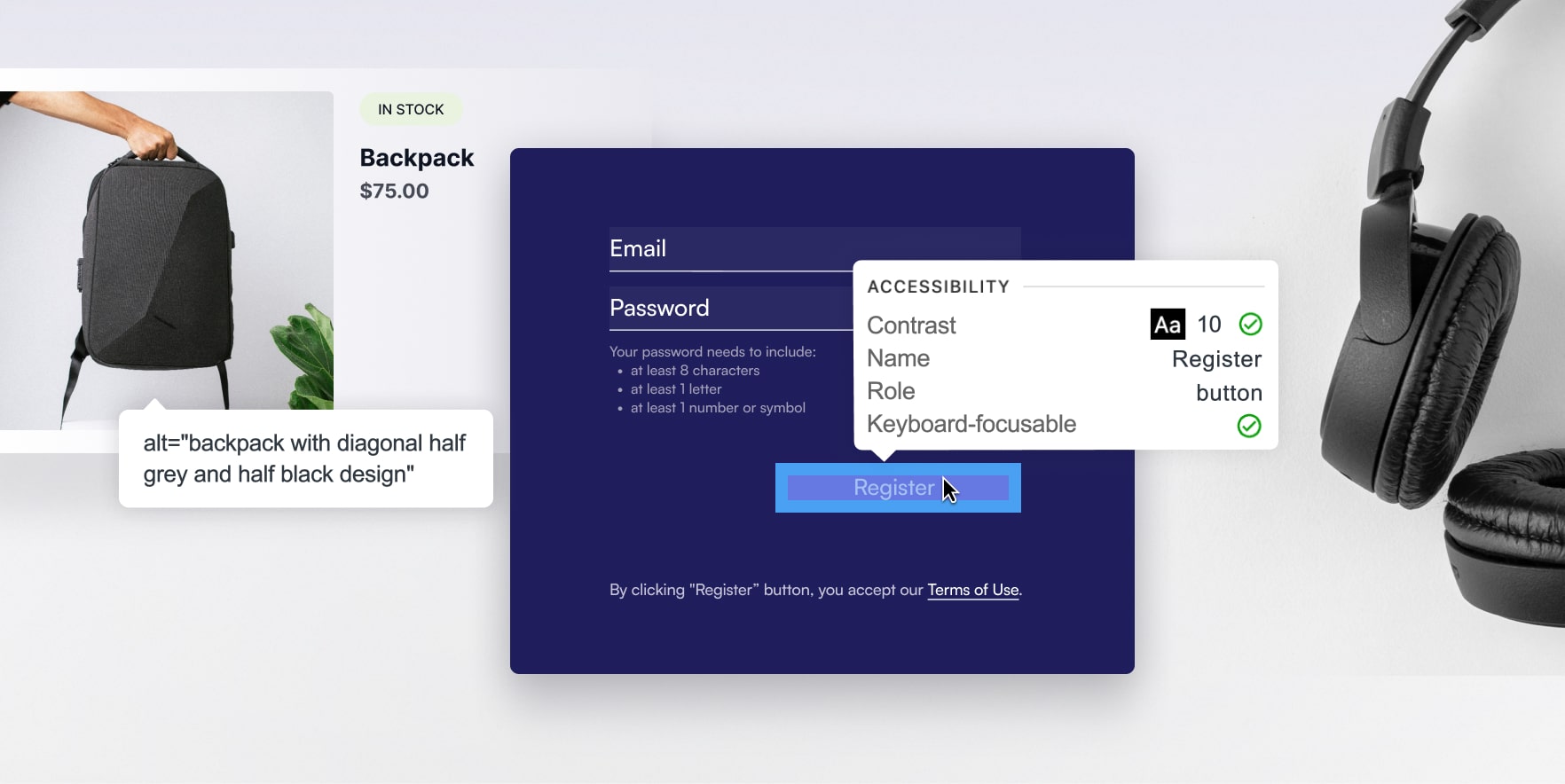
10. Accessibility issues
Any modern website should be ADA (Americans with Disabilities Act) accessible. This includes adjusting of color contrasts and textures, font sizes, providing various navigation options, video captions, etc. However, a truly inclusive e-commerce experience goes far beyond the styling patterns check-up, although it’s clearly important. The foundation of accessible e-commerce is thoughtful communication between the user and the interface, and that’s where accessibility goes hand in hand with great interaction design.
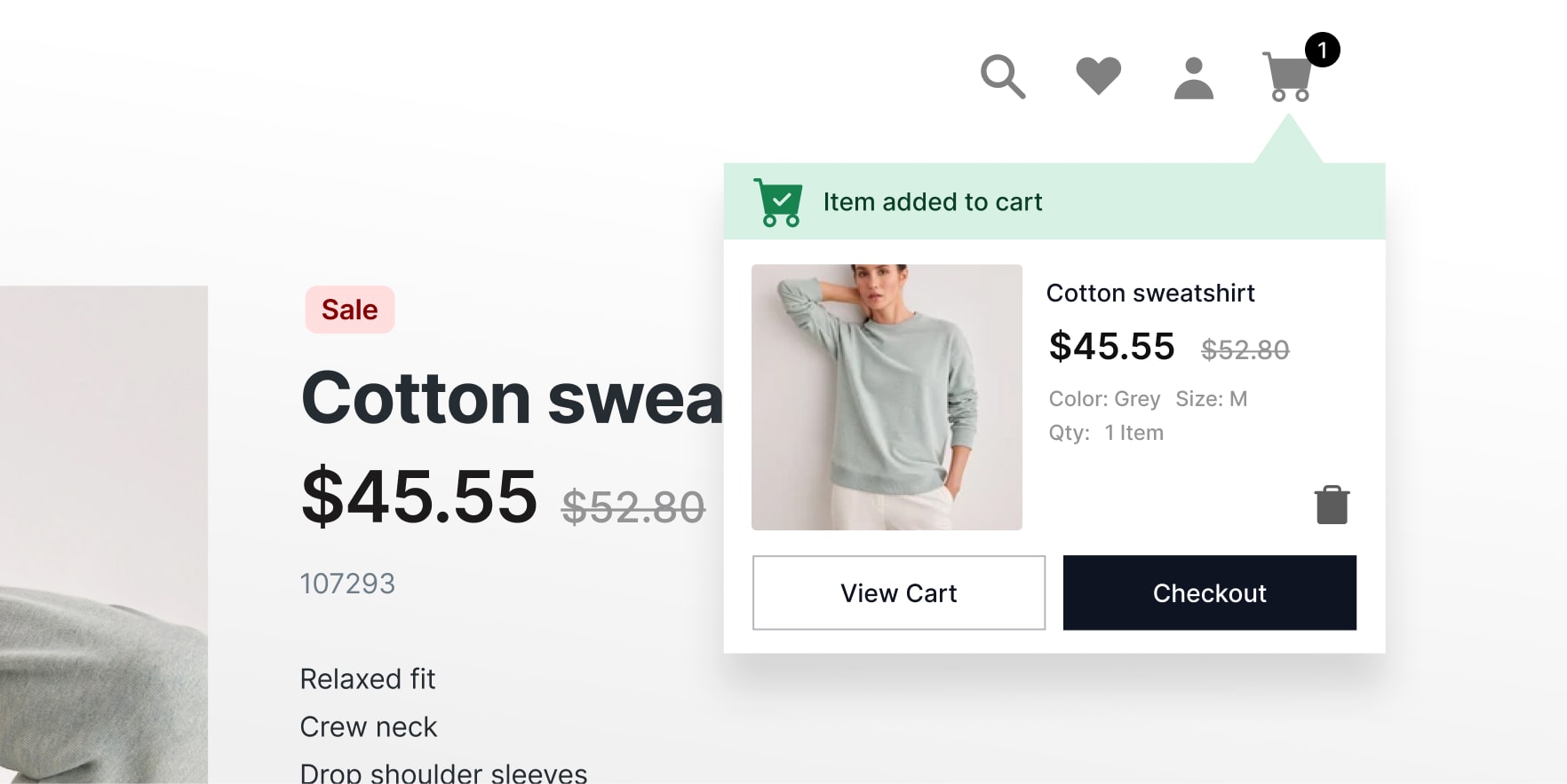
Every user action — whether initiated by hand, screen reader, or keyboard — requires a response to reassure or encourage the user to take the next step. The need for clear confirmation of key user actions is obvious here: from simply hovering over interactive controls to providing proof of products added to a cart; or requested alerts for out-of-stock items; or error messages for failed payment methods.
There’s more UX ground to cover when it comes to disabilities that rely on what’s beneath the surface of a simple button: interface controls that are used programmatically. In this case, interface components designed and implemented without semantic meaning or value become difficult or impossible to operate. A well-documented library of UI components, coupled with object-oriented implementation, will pay off if shoppers with impairments can successfully navigate the most complex processes, like multi-field order placements.
Expert Opinion
A checklist for an inclusive and efficient interface should include alt text, which serves as an accessible name for the product image and ensures that screen readers accurately convey the brand’s message.
Controls need accessible names that match the visible label and can be navigated by voice without confusion. Users will also appreciate tooltips with names on hover for controls without accompanying text, such as icon buttons, to avoid misinterpretation.
Don’t forget the accessible role attributes, which are used by assistive technologies to convey the purpose of the UI component (and how to interact with it), as well as component states and values. For example, for controls that change the visual appearance, such as a drop-down menu item or a toggle, their current state needs to reflect whether their associated content is now open or collapsed.
Make it easy to identify and correct errors. Don’t go minimalist: combine color coding with clear error messages. Additionally, little things, like order status indicators, are key to ensuring that every user receives the most important follow-ups.
Finally, explore the possibility of allowing the use of alternative payment methods – such as PayPal, Google/Apple Pay – to bring the final checkout steps down to a few clicks.
11. Non-optimized forms
Finally, let’s look closer at the process of filling in a form on an ecommerce site, which is already far from the top of users’ favorite activities. And if your forms are not optimized for convenient and quick completion, it once again increases the chances that users will not convert.
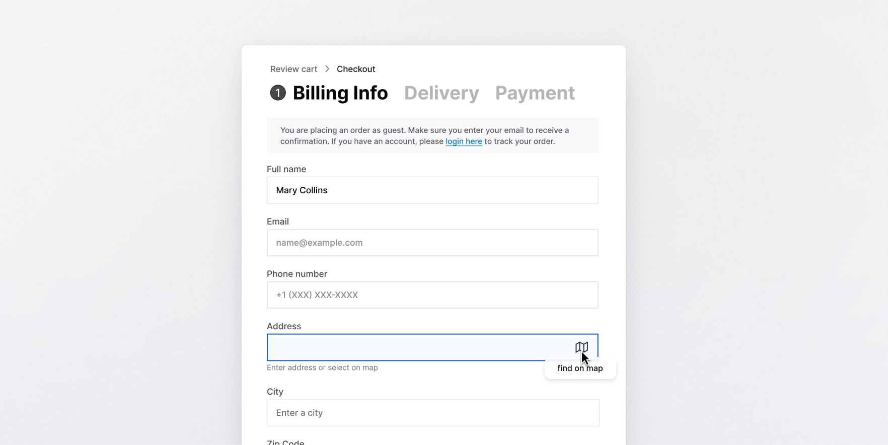
In general, an optimized form should be as user-centric as possible, meaning it shouldn’t demand too many actions from a user. The most common issues related to form optimization are:
- No autofill functionality
- Overload of fields or inconsistent grouping
- Inadequate use of dropdowns for too-many and too-few options
- Incorrect input methods for specific formats, such as phone numbers
An example of usability best practice for drop-down menus would be to allow the user to start typing, prompting suggestions that speed up selection and let them finalize the purchase. Such things matter when talking about retaining users and leading them to conversions.
UX issues in ecommerce: summing up
The subject of UX design for ecommerce is highly complex and consists of dozens of best practices and recommendations, not to mention personalized suggestions that depend on the site’s brand voice, general appeal, and proposed goods and services. The UX mistakes in ecommerce that we’ve listed above are the most common issues, though there are many more that one can encounter. If you want to learn more about stellar and user-centered UX ecommerce design, SoftTeco can gladly assist you by setting up a consultation with our UX design team. Or you can hold an independent research: in this case, do not forget about continuous testing to learn which areas of your site perform the best and which ones can use a bit of optimization.

Comments