In the world, when users’ expectations are as high as ever (and they keep growing!), even the smallest mistake can be critical. This is especially true for bad UX since the design of applications forms the first impression and it can either make it or break it. In this article, we collected the most disastrous UI fails and we also provided tips on how to fix them in case your app has similar issues.
The never-ending dropdowns and checkboxes
There once was an experiment back in 2000 when people were presented with 24 different jams to choose from – and then they were presented with 6 options only. It’s easy to guess which jam booth saw a bigger number of sales: the one where people were not overloaded with choice (aka the one with 6 jams). This jam study leads us to one of the cornerstones of good UI: do not overload users with too many options. Or, if you need to have many options, at least make the selection process convenient.
You might have come across this horrific example of a never-ending checkbox that represents bad UX design on so many levels.
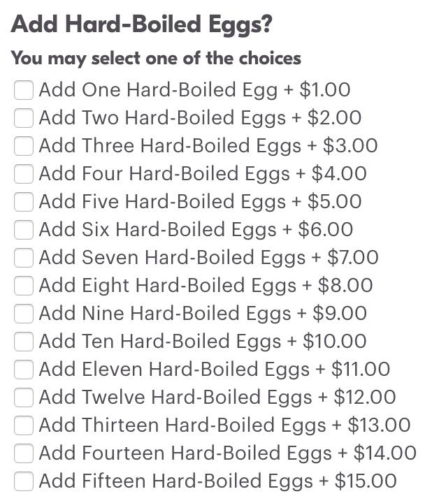
We won’t even talk about the phrasing or price display here because the true jewel in the crown is the checkbox itself and the number of options that it presents.
Now, people don’t really like checkboxes. And this one might have seen a lot of user rage in particular because it duplicates the data, is completely inconvenient, takes too much time to go through, and simply makes no sense.
Another example of bad UX is this dropdown menu.
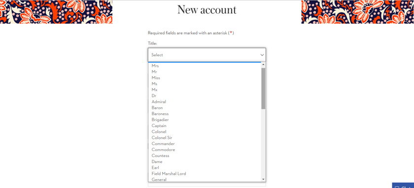
We get it – the website really wants to approach its customers in a respectful manner and consider their possible titles. On the other hand, why make users go through this never-ending choice instead of presenting them with universally acceptable “Mr., Miss, and Ms.”?
How to recover
In order to provide users with the most user-friendly and fast selection option, consider the solutions listed below. An important note: you must always choose a selection form based on the number of options and their nature (i.e. well-specified options, frequently asked inputs, short inputs, etc.).
- Checkbox: good for binary (on/off, yes/no) decisions or for multiple choice.
- Toggle switch: good for binary decisions.
- Radio buttons: good for a small number of options (3-4).
- Steppers and sliders: for quantitative values when a user has to select a certain quantity.
Bonus tip: it often happens that it’s much easier for a user to type in a needed input instead of searching for it in a dropdown value. An example of such input would be the year of birth or a ZIP code. In such cases, replace a dropdown with an input field. And in case you want to keep a dropdown menu but it’s lengthy, allow users to search for the needed option by typing.
Making a user think too hard
One of the deadly sins of UX/UI is making a user think too much and take too many steps in order to achieve a goal. Examples of such bad UX are:
- Presenting too many options to users;
- Poor structure and poor navigation;
- Too many steps in a single process (i.e. complicated checkout);
- Thinned content (breaking down a small chunk of content into even smaller chunks).
Now, with information overload and a plethora of alternatives available these days, users don’t want to spend their time figuring out how to use your app. Instead of filling in 10+ forms or bothering their head over finding the needed information, they will simply leave (and most probably uninstall the app too). That’s not something you want to see, do you?
How to recover
If you are not sure about whether your user journey is smooth and frictionless, take a look at the conversions. Normally, such metrics as a low number of conversions, a small amount of time spent on a page, a low task success rate, and others indicate that something is wrong with your design and users have issues with completing tasks and navigating the app.
Here are some tips on improving the bad UX situation and making the user experience more meaningful and pleasant:
- Incorporate guest checkout and registration as a guest. In fact, the report by Baymard Institute states that 34% of users leave because registration is required. Now imagine how much of a revenue one would be able to see if they retained these users as guests on their website?
- Rethink your structure and check if it’s user-friendly. Are all app categories organized in a logical manner and do you encounter any issues when looking for specific information? Take a user journey yourself and double-check your own product.
- Minimize the number of steps that you require from the user. In order to do that, you might want to rethink your main touchpoints, clarify the user journey itself, and eliminate those steps that do not directly impact the completion of an action.
Poorly written CTAs
Call-to-action buttons are amazing. A well-designed CTA can greatly boost your conversions and encourage users to explore the needed areas of an application. On the other hand, poorly written CTAs can discourage users not only from taking action but from dealing with your brand at all.
One of the trends that seem to be taking place in recent years is CTA confirmation shaming. You might have seen such pop-ups when a website insists you sign up or subscribe for something. However, if you decide that you don’t need this incentive, you can’t just press “No thanks” – you will see a message like “No, thank you, I don’t want to make profit” or “No, I don’t want to invest in my well-being” instead.

This form of aggressive marketing may work in some rare cases, but in general, it greatly discourages users from interacting with your brand. Other CTA fails are usually lack of value (and that’s what CTAs are all about) and bland language.
How to recover
When crafting a CTA, keep in mind its main goal: to grab users’ attention and persuade them to complete a required action (i.e. sign up for a newsletter or register on a website). Thus, your CTA message has to be concise, informative, and engaging. And don’t forget about the number one priority aka offered value. A CTA has to propose something in exchange for action so make sure that the offer corresponds to the needs of your target audience.Content overload
Well-written concise copy can do wonders for your application. It leads users towards completing conversions, informs them about the value that your product offers, and overall contributes to a great user experience. But if you mess up your content from the start, it will immediately make a negative impact on further user experience.
A good example of bad UX design in terms of content is this website that made an attempt to explain cookies preferences.

While the initial idea is fine (to help users better understand their options), this massive chunk of text looks intimidating and kind of makes you want to leave the website before you begin navigating it.
How to recover
First, you can always cut down your content – ask a professional editor or copywriter for help. Second, if you absolutely want to keep all of the text on the website, at least offer users an option to read it or skip it. You can hide the text under the “Learn more” button so if a user taps it, the content will become visible. In this way, you retain the content but it does not overwhelm the user upon landing on the page.
Over-the-top colors
Extreme bright colors have been gaining popularity in design – but with great power, comes great responsibility.
Whenever you deal with something extraordinary, it’s easy to mess up. Non-traditional design approaches need to be treated carefully in order not to overcomplicate the overall look of an app, not to confuse the user, and not to affect the readability of content. The latter is the case with an old design of the Teamweek company (now known as Toggl Plan).
The mint color itself looks great. But then there is this white text in the box which becomes almost unreadable on the mint background. This leads us to the conclusion that one should carefully balance used colors and test before launching an app in production.
How to recover
When selecting colors for your app (or any other product), you need to keep in mind best practices of choosing a color palette:
- Remember that a certain color represents and evokes certain emotions. Do not ignore color psychology since it’s an incredibly powerful tool that works on our subconscious level.
- Test how selected colors work with text and other elements of UI. Check for readability and clarity and ensure that colors do not cause any confusion.
- Do not experiment for the sake of experimenting. When deciding to go with a non-standard solution, make sure you have a solid reason for that (i.e. stand out from the competition, grab attention, etc.).
- Do not overlook a minimalistic approach. Even though minimalism is not a new design trend at all, it remains popular because it instantly adds clarity and readability to the UI.
Summing up
The main thing to remember is that UX/UI is all about users – bold colors and experiments come second. If your design does not evoke certain emotions and does not lead the customer towards the desired goal, you need to think about whether your design-related decisions were so good after all.
Our biggest recommendation for UX/UI design would be: test, test, test, and always collect user feedback, aiming for maximal usability. In this way, you’ll eliminate guesswork and will be able to tailor your application precisely to user needs and not to some abstract ideas on what a good design should look like.


Comments