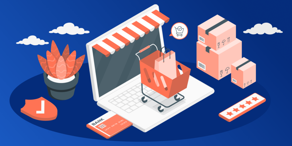
The ultimate goal of any e-commerce store is to increase the number of conversions. Thus, store owners constantly look for new ways to engage the users and encourage them to buy. What they often miss is the fact that conversions are heavily impacted by such common things as a correctly placed CTA button or intuitive navigation. These core features of any e-commerce store tend to be overlooked and therefore they result in poor user engagement and lower sales.
This article reviews the essential e-commerce features that contribute to better user engagement and help persuade the user to buy. You don’t need to reinvent the wheel – just follow this checklist and see which features are already implemented on your site and which ones should be.
Clear navigation
Navigation is one of the biggest pain points for many e-commerce stores. Confusing and complex navigation not only annoys the users but discourages them from exploring the store and making a purchase. Clean and intuitive navigation, on the other hand, is capable of guiding the user towards the desired purchase and helps find the needed product or service fast. So what can you do to improve the navigation in your store?
Have consolidated menu
A consolidated menu is the navigation menu on top of your page. When a user scrolls down, this menu remains fixed and thus a user can easily get back to the needed section without the need to scroll all the way up.
Remember that this menu does not have to be huge in order to be noticed – it will be enough to make it 1/5 from the page’s size. And research by Google shows that the implementation of a consolidated menu significantly impacts the page visits and increases their number.
Order categories wisely
For sure, there are some categories in your store that get most of the users’ attention – so make sure to display them on the home page and order the most popular categories by traffic. This approach will result in the traffic increase and a possible increase in the users’ interest.
As for the subcategories, make sure they make sense. It often happens that there are too many subcategories and the users simply do not understand which one will contain the needed product. So we highly recommend reviewing your existing categories in order to check if they are understandable and accessible.
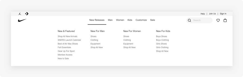
Follow the UX standards
In e-commerce, there are certain UX standards that need to be followed in order to facilitate and improve navigation. These standards include:
- The placement of the cart icon in the upper right corner
- The navigation (consolidated) menu on the top
- Dropdown menu for categories browsing
These UX examples can be met in almost any e-commerce store. Therefore, if your users have browsed several other stores before visiting yours, they would expect the same navigation and same element placement. Imagine how you might confuse them if you place the shopping cart icon on the left side so they will spend time searching for it on the right.
When designing an e-commerce store, it is important to make it as user-centric as possible so the whole navigation and browsing process is fast and as hassle-free as possible.
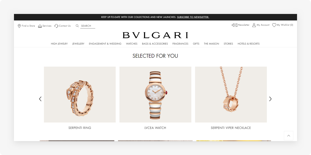
Easy search
The search option is essential for any e-commerce store. If a user visits your website for the first time, a search bar will help quickly navigate to the needed item. And if a user visits your store with a clear intention in mind, the search bar once again will immediately take them to the needed page.
Even though the search seems like an obvious feature, there are a few tricks on how you can optimize it.
Replace a search icon with a search bar
This is not a solid rule but more of a recommendation: try replacing the search icon with a search bar. According to Google, a search bar promotes engagement and results in higher engagement than the use of a search icon. You can test both options and see which one resonates the best with your users.
Provide automatic suggestions
Automatic suggestions are a very user-friendly feature. When a user starts typing “leggings”, for example, the page may offer suggestions like “sport leggings” and “color leggings”. In this way, a user can immediately see what kind of products you can offer. As well, it saves the user’s time since the user does not have to type the full keyword but a few letters only.
Always return search results
It may happen that your store does not have an item that the user searches for. So what do you do in this situation?
A common mistake that many store owners make is just putting “404 not found” or “Sorry the item is not found” message on the page and leaving it like that. However, the golden rule of e-commerce states: always return search results!
At this point, a question may arise: what do I put on the page if the item is not in my store? Actually, you can do a lot! You can put there:
- Top product categories
- Best-selling products
- Favorite products of other users
- Products with the most promising reviews
The main idea here is to avoid the user leaving the site and to encourage him to keep exploring. And by putting a certain offer to the “404 not found” page, you will significantly increase your conversions and sales as most users willingly check out what else you can offer them.
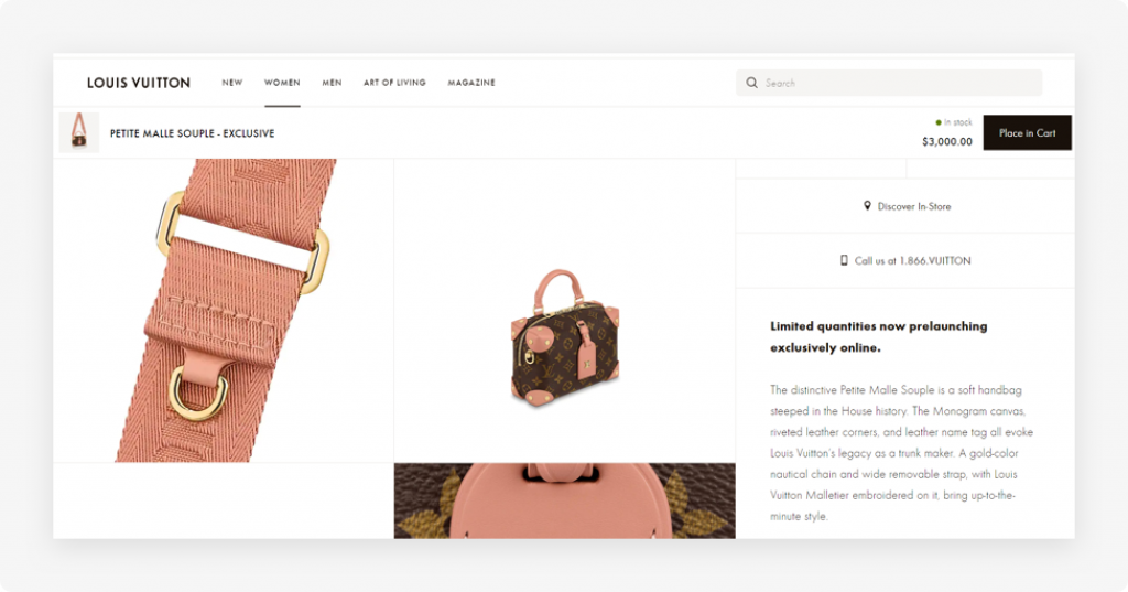
Optimized checkout
The checkout page is another pitfall that may lead to lost sales and customers. The biggest problem of many e-commerce stores is that the checkout process is too complex, lacks transparency, and thus leads to cart abandonment. To minimize the risks and resolve the problem, we provide the following solutions.
Enable guest checkout
The key to a successful checkout is the minimal number of steps that a user needs to take in order to complete the purchase. However, if a user must register before starting the checkout, it may actually be a major turn-off.
One of the most efficient ways to speed up and facilitate checkout is to enable guest checkout. This means a user does not have to create an account – all they have to do is enter their email and they will immediately be able to proceed to the checkout page. This option significantly
reduces the cart abandonment rate and is a real lifesaver when it comes to customer retention.
Minimize the number of steps in the checkout
As we already said, the faster the checkout process is, the higher the chances are that a user will complete the purchase. Hence, have a good look at your checkout process and see whether there are any unnecessary steps that can be minimized or eliminated.
Some stores have a two-page checkout and it does not work so well as a one-page checkout. Another common mistake is that the checkout page has too many fields that can be consolidated. For example, instead of having “Name” and “Surname” fields, you can simply ask users to fill out the “Full Name” field. Such a minor change actually has a big impact on the user’s behavior.
A good idea is adding a progress bar to the checkout. The progress bar serves as a visual representation of the customer’s progress and encourages them to complete the checkout.
Make the checkout transparent
Imagine a situation when a user chooses an item and is satisfied with the price. They then proceed to the checkout only to find that the price was doubled by taxes, shipping, and other fees. With no doubt, the customer will be upset and will most probably will cancel the purchase.
Unfortunately, this is a rather common situation when there are hidden fees popping out all of a sudden. To avoid misunderstandings, make the checkout as transparent as possible. By that we mean: always provide all the financial information to the customer before they start the checkout process. You can also add a calculator to a checkout page so the customer can calculate the final price of the product and see what kind of charges are there.
Good product photos
Your costumers are coming to your store for certain products or services so you want to make these products as appealing as possible. And since the customers cannot touch and feel the products in an online store, product photos become a critical part of the buying decision. Here are a few tips on making the best out of the product photos.
Watch the quality and size
When uploading product photos to your store, make sure they are of good quality. As well, ensure that this quality does not get lost if a user opens the store page on their mobile device. Responsive design is an absolute must for any website so you need to watch for the images’ size, dimensions, and quality.
Show product details
This trick can actually persuade customers to buy! What you need to do is not only show your product from different angles but also add the photos of product details, such as shoelaces, engravement details, close view of the material. Such photos help create a better and more “immersive” impression of a product as if the user actually sees and tries it.
Optimize the images for better performance
E-commerce websites tend to have many photos so naturally, all these photos may take quite a while to load. In order to speed up your website performance and improve user experience, you need to optimize the images. You can do it by optimizing the image size, deploying lazy loading, or using a CDN (Content Delivery Network). Just remember that slow and heavy loading leads to low user experience – and online shoppers are not willing to wait for longer than 3 seconds for the site to load.
Care about the customer
Every customer wants to feel special – so how can you add more personalization and show that you truly care? Here are a few tips.
Support different payment options and multiple languages
When an e-commerce store is launched, it often happens that it’s a small local store for certain customers only. But if such a store grows and gains more and more clients, a store owner might start considering the possibility of going international. Or you may consider making the store international from the start – either way, you need the store to support different languages and different payment options.
If you accept only one or two payment options, that might be the reason why your conversions are low. Remember that different countries prefer different payment systems so keep that in mind when thinking about your target audience. As well, it’s always nice to offer different languages to different user groups. This will show that you care about their user experience and want to make it as enjoyable as possible.
Optimize the CTAs
A CTA (call-to-action) button is a sales booster if implemented right. These buttons grab the customer’s attention and encourage them to complete a certain action that will bring value.
So what’s the key to a converting CTA? First, the design. A CTA button should be big and visible enough to stand out from the rest of the content on the page. However, some store owners opt for ghost buttons (with transparent background) or the ones that almost merge with the page. Thus, to find the best option, we recommend to A/B test your buttons and see which ones cause the most engagement from the users. As well, remember about the placement. A CTA button can be placed:
- In the upper part of the page for the users to see it
- Near the important elements (such as product price)
- In the form of a pop-up
Second, work on the button’s message. Research shows that personalization of a CTA button message results in much higher engagement than cliche messages like “Click here”. So how do you personalize a CTA button?
Try relating its message to your products and services. If you sell fragrances, you can write something like “Find your perfect scent” instead of “Browse the catalog”. The more you alter the CTA message to the website content, the more interest it will provoke in the customers.
Offer additional value
Another efficient method to engage the customer and show that you cater to their needs is offering additional value. This can be:
- A FAQ page with all the common questions answered
- A blog with the articles describing the best and most creative ways of using your products
- Top-notch customer service (live chat, social media, an option to order a call).
By adding a few extra touches, you instantly show how much you care about your clients and how you want to offer them something else in addition to the products. And this will result in a sales increase and a boost in customer loyalty and satisfaction.
Summing up
These are just a few features that the customers look for in an e-commerce store – and there are many more of them that need to be considered. The creation of an e-commerce store requires a significant amount of dedication and time as well as the investment of finances and resources. However, if everything is done right, you will be rewarded with the store expansion, loyal customers, and steady sales growth.

Comments